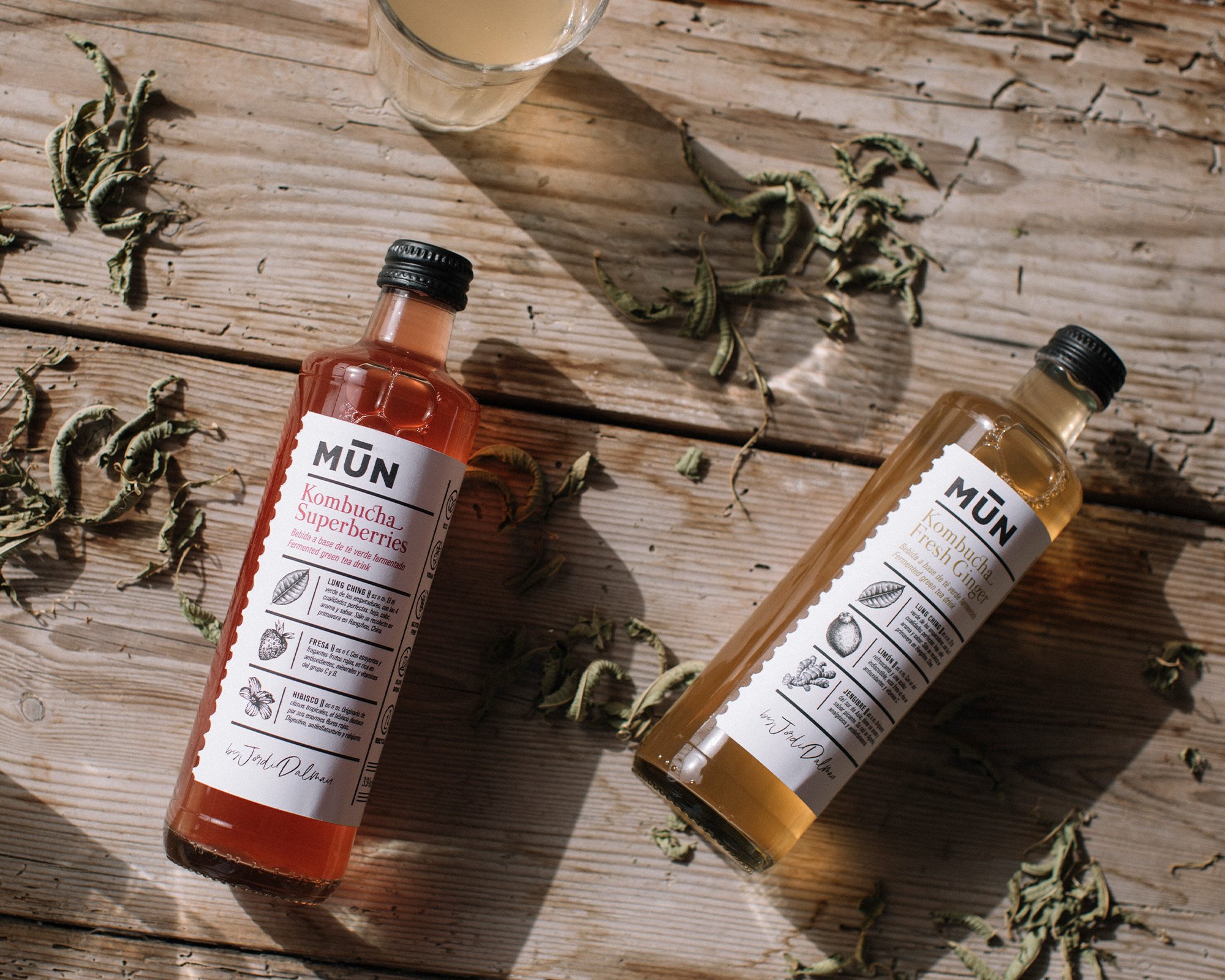
MŪN Horeca
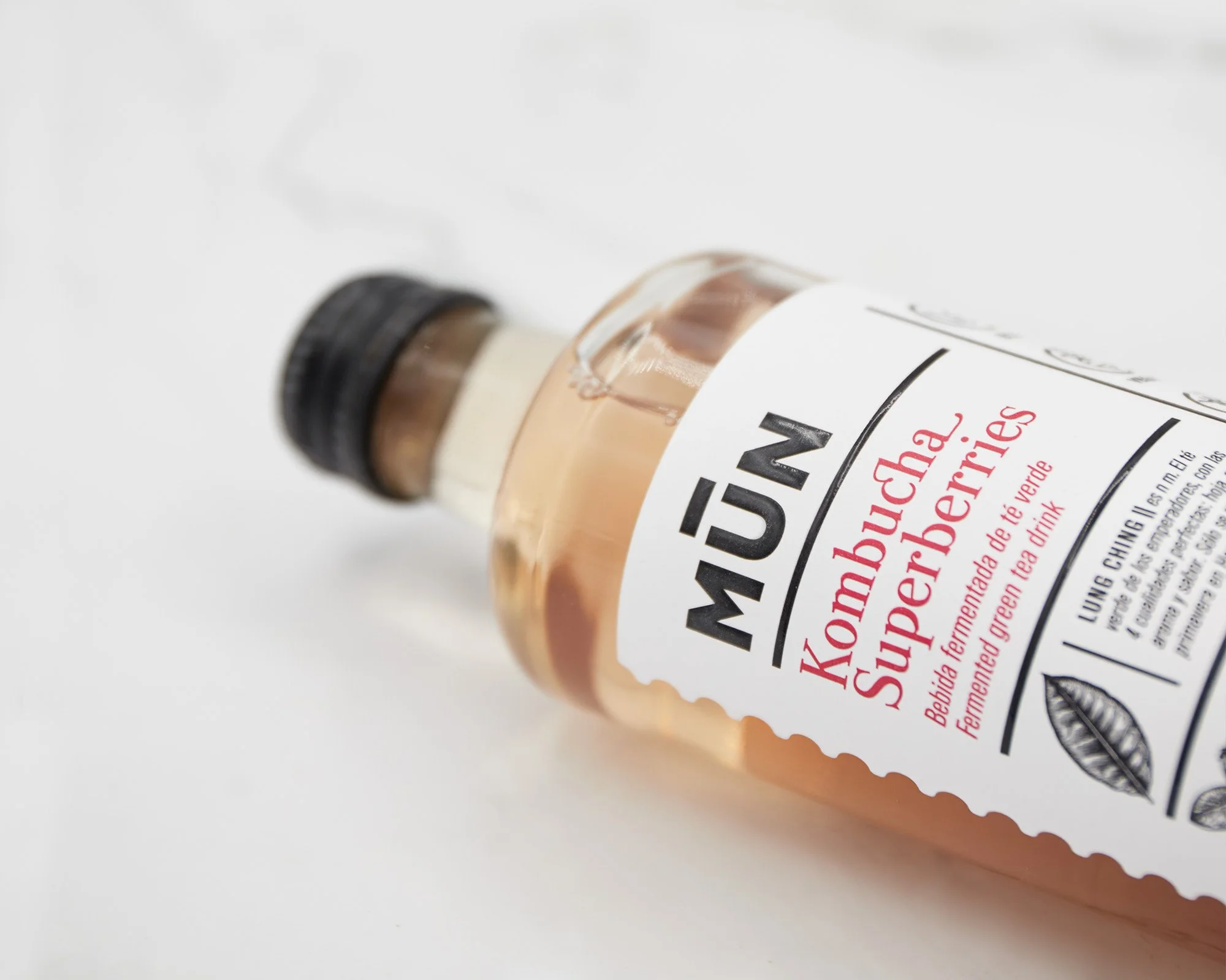
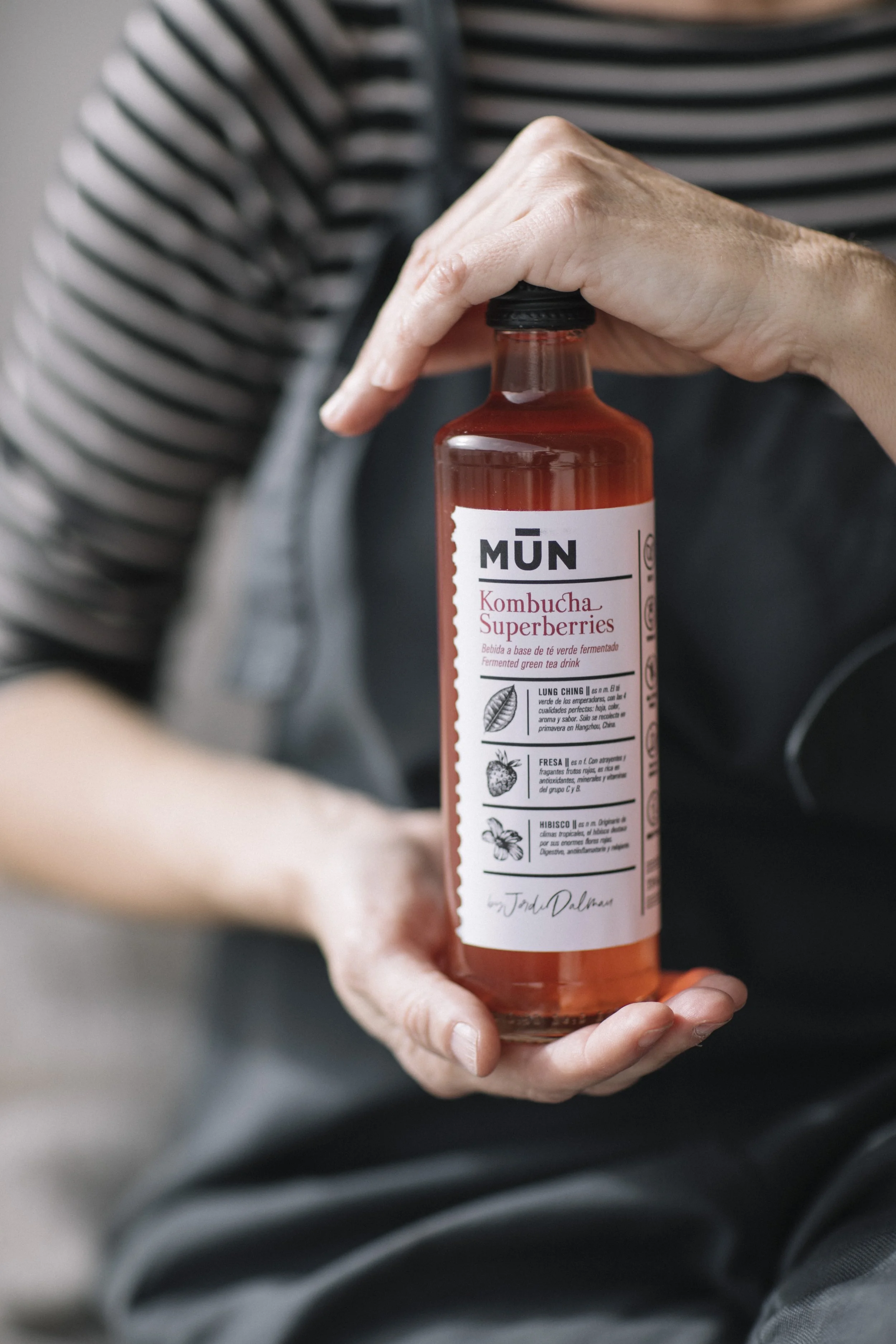
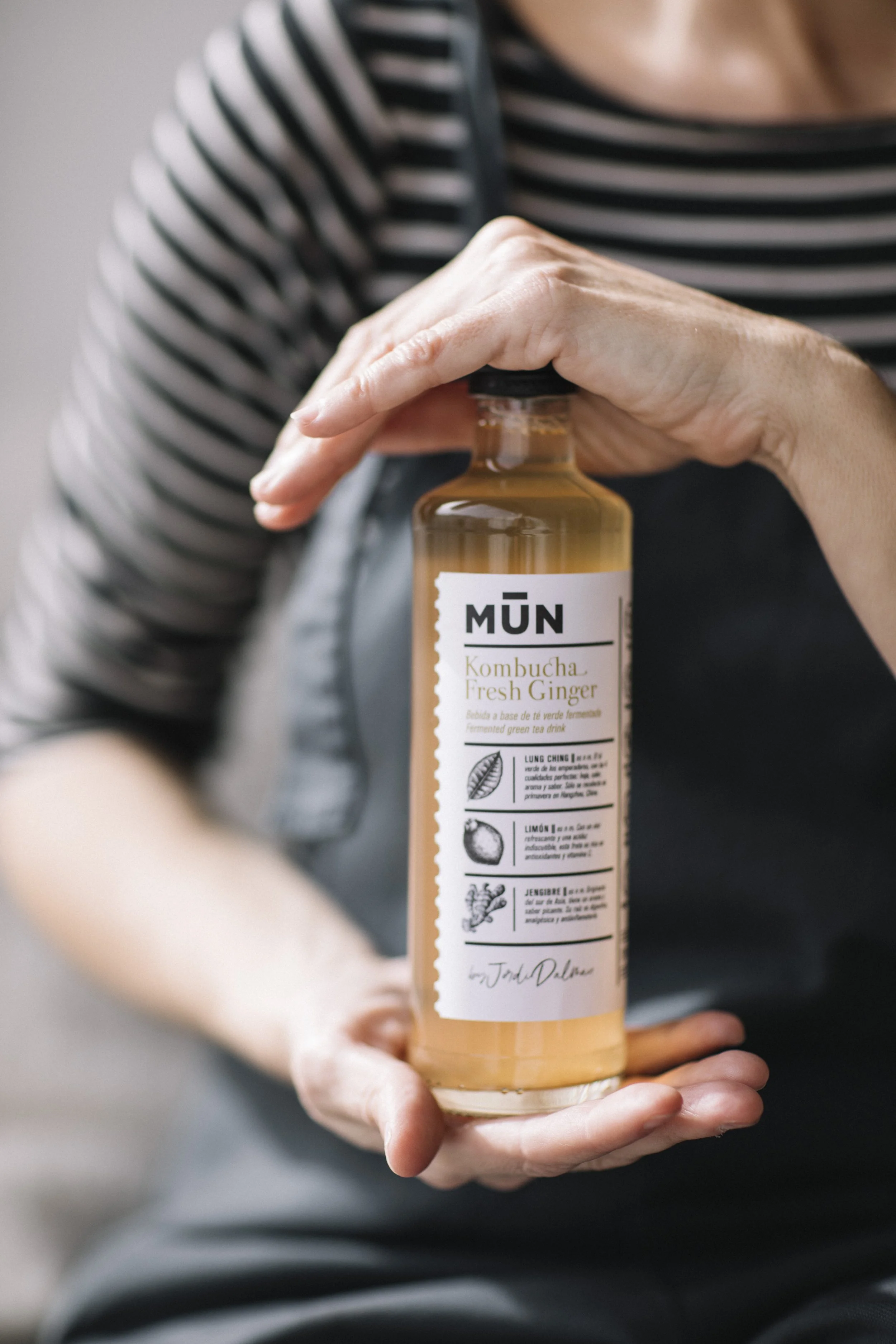
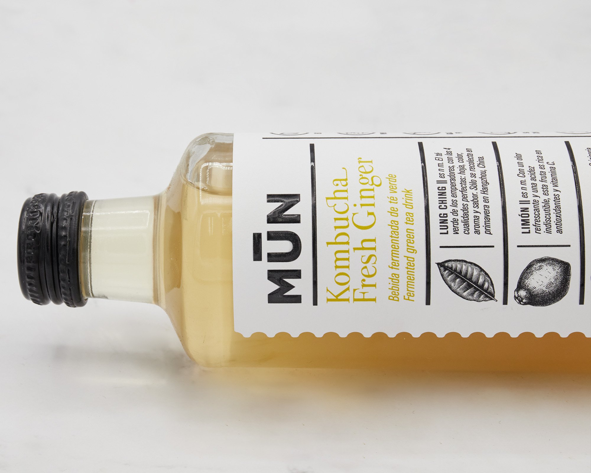
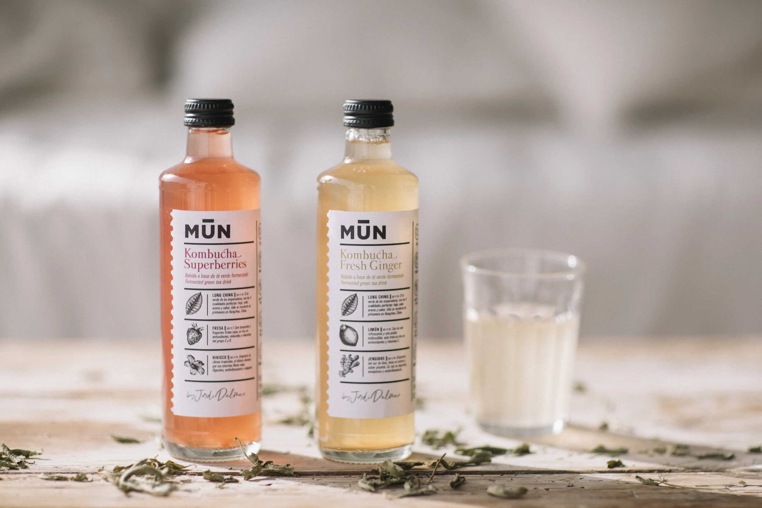
For MŪN Ferments’ HORECA range, we developed a new premium packaging concept rooted in minimalism, elegance and visual sophistication.
A label that embraces simplicity as the ultimate expression of quality, where every graphic element has a purpose. A clean, contemporary and timeless design created to position MŪN kombucha within the world of fine dining and premium hospitality.
Industry
Packaging
Food&Beverage
Client:
MUN Ferments
Creative & Art Direction:
Studio Regina Puig
Photographer:
Noemí Jariod
The Strategy
Our strategy focused on elevating the perception of MŪN Ferments within the HORECA sector, creating a more sophisticated product identity aligned with the visual codes of premium gastronomy.
We embraced a minimalist approach to communicate quality, authenticity and exclusivity while remaining true to the brand’s essence.
The Solution
Our concept is inspired by a flock of black sheep—a powerful symbol of rebellion, We designed a premium label where refined graphic elements, balanced compositions and carefully considered typography create an elegant, contemporary aesthetic.
The result is a distinctive, understated packaging design that communicates the product’s value through simplicity and strengthens its presence in sophisticated gastronomic settings.
What we did
Brand Design
Strategy
Visual Identity
Packaging
Art direction
We’re passionate about bringing your ideas to life with designs that truly connect and inspire.
Other projects you may like…
MŪN Premium

Priordei

Mercabarna Fast Pass

Milola

MŪN Isotonic

Cultura Mataró