

MUN Premium
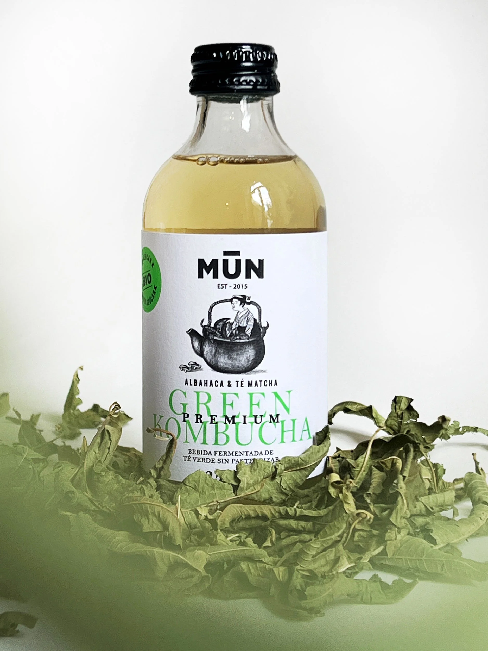
Since 2015, MŪN Kombucha Premium has been the choice of kombucha connoisseurs. Crafted with top-quality Lung Ching green tea and fermented slowly for up to 30 days, it delivers a pure, authentic flavor with minimal residual sugar—up to 18 times less than its competitors.
Nearly a decade on, we were tasked with redesigning the packaging for this iconic line, enhancing its artisanal identity through a more refined visual system. The result is a collection of six detailed labels, each telling a unique story through layered illustrations, classic typography, and unexpected neon accents. This balance of tradition and boldness gives MŪN Premium a standout, elegant presence.
Client
MUN Ferments
Creative & Art Direction
Studio Regina Puig
Copywriting:
Marcè Pérez
Label production:
Group micros
Product Photography:
Ferran Barjuan
Lifestyle Photography:
Pia Carles
Industry
Packaging
Food&Beverage
Awards
LAUS, in book 2025
in pack and label collection


The Strategy
The strategy behind the redesign of MŪN Premium focused on shifting the perception of the product from functional wellness beverage to an elevated, story-rich experience. In a category often dominated by ingredient-centric visuals and health claims, the goal was to build a more emotional and artistic connection with the consumer.
We aimed to highlight the craftsmanship behind the product—its slow fermentation process, premium ingredients, and nearly decade-long heritage—through a sophisticated and expressive visual language. The challenge was to create something that felt premium, yet approachable, with a strong sense of individuality for each flavor.
The Solution
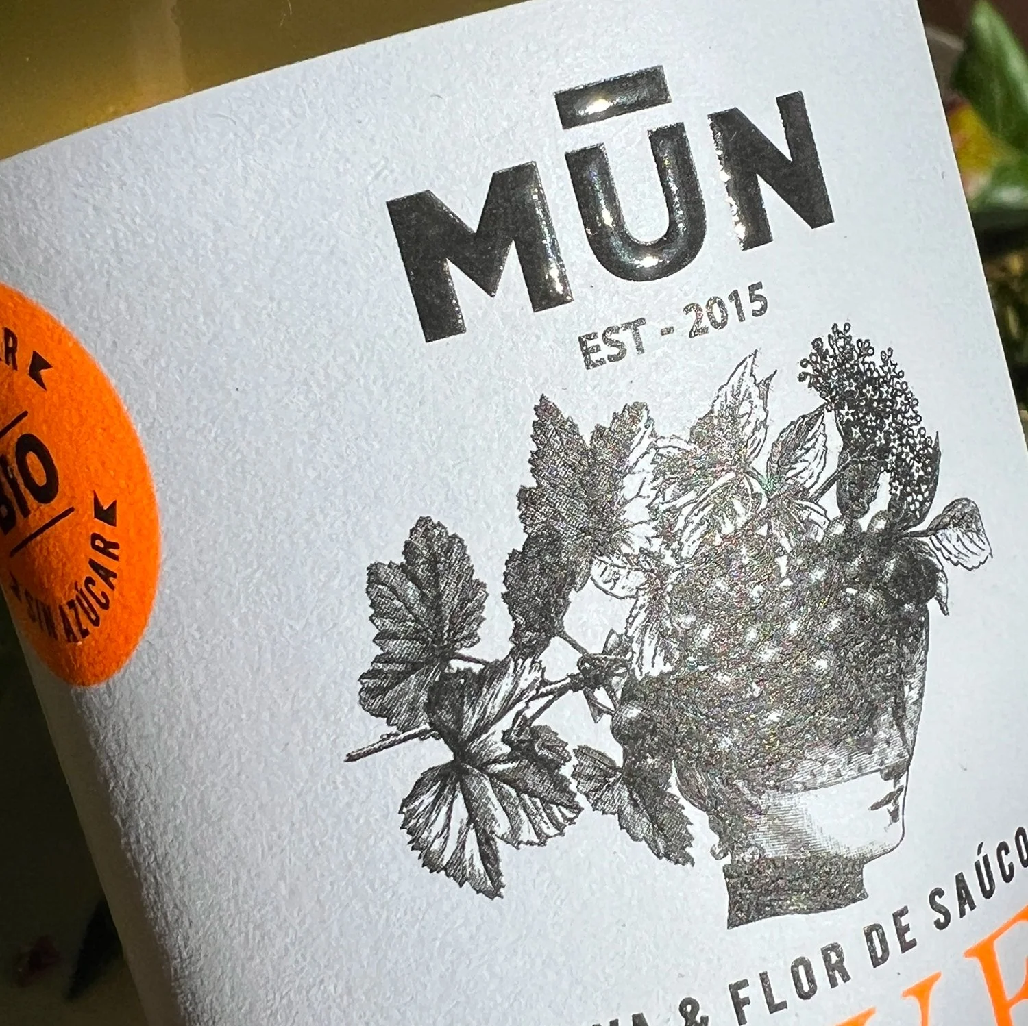
To bring this strategy to life, we created a set of six labels, each featuring a unique illustration that plays with double visual meanings—offering layers of interpretation and a sense of discovery. The narrative nature of the illustrations gave each flavor its own personality while tying the range together with a cohesive storytelling style.
A classic typographic system was chosen to reinforce the artisanal quality of the product, while bold neon accents were introduced to add contrast and a contemporary edge. The result is a visual identity that feels both refined and unexpected.


What we did
Brand Design
Strategy
Visual Identity
Packaging
Art direction
Digital
Website development
Social Media Guidelines
Our clients talk

We’re passionate about bringing your ideas to life with designs that truly connect and inspire.
Other projects you may like…

Flopp eco

MŪN Isotonic

MŪN Radikal

Priordei

MILOLA

Hypnotic Barcelona