Aliança Mataró
L’Aliança Mataró is a health insurance with over one hundred years of experience, rooted in the city of Mataró and in the heart of the Maresme region. Since its beginnings, it has been a local organization committed to people’s well-being, offering care that is both personal and trustworthy.
We were commissioned to create the new visual identity for L’Aliança Mataró, with the goal of updating the brand, breaking away from its traditional image, and connecting with new generations and more diverse family profiles through a fresh, approachable, and contemporary visual language.
Industry
Health Insurance
Client:
Aliança Mataró
Creative & Art Direction:
Studio Regina Puig


The Strategy
L’Aliança Mataró sought to connect with a younger and more modern audience without losing the trust and prestige it has built over the years. The challenge was to modernize its image to reflect the diversity and reality of today’s families — single-parent, blended, same-sex, adoptive, and many others — while also strengthening its digital and social media presence.
The strategy focuses on conveying values of inclusion, closeness, and modernity, offering an image that feels approachable and recognizable across generations. The goal is to maintain the brand’s long-standing credibility and stability, while adopting a more open and contemporary outlook
The Solution
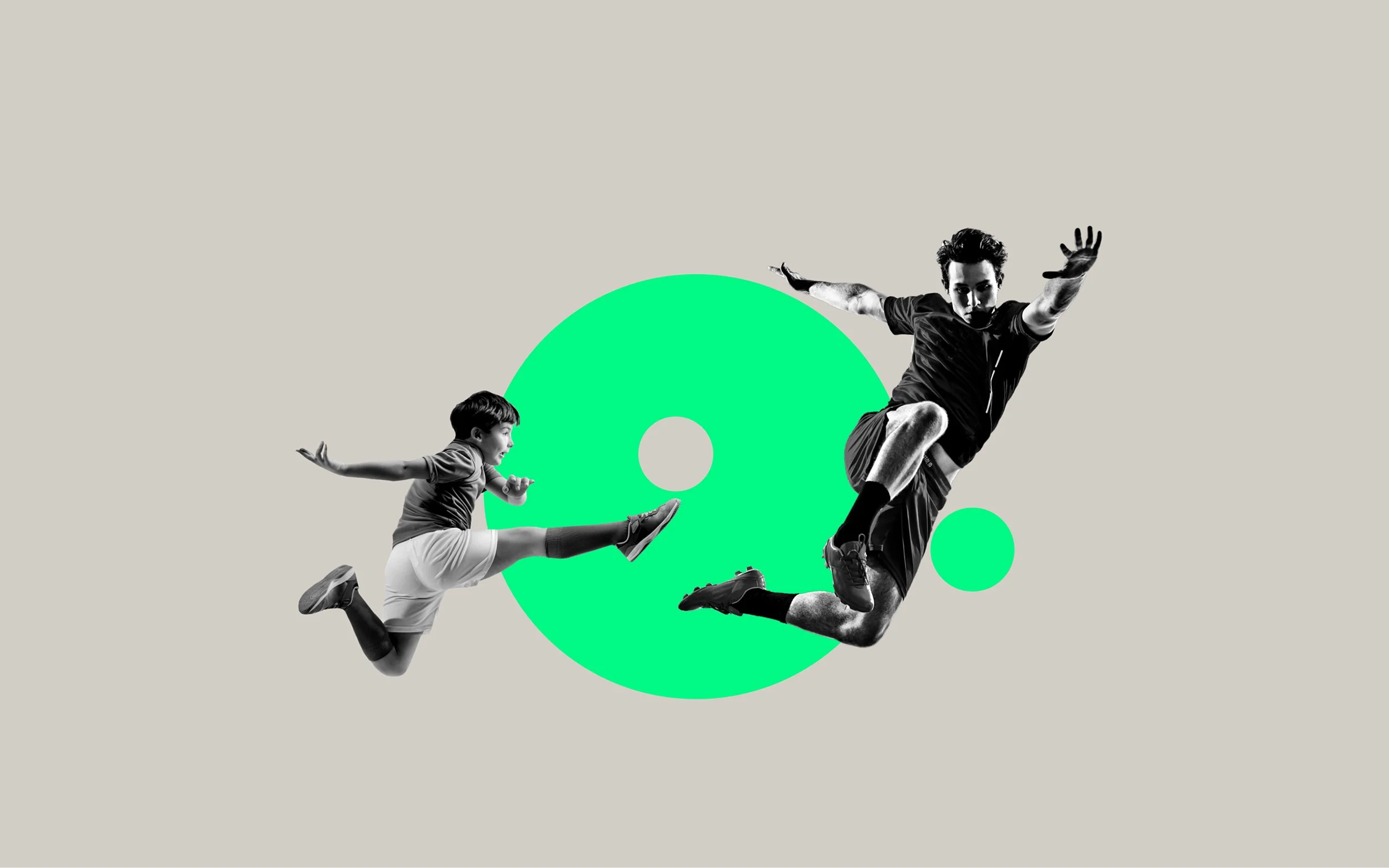
The new visual identity of L’Aliança Mataró embraces a fresh, approachable, and contemporary graphic language. The logo and visual system symbolize the diversity and unity of different types of families, while the renewed visual communication aims to connect more effectively with new generations across both digital and physical platforms.
This brand evolution preserves the essence of L’Aliança Mataró — an organization built on trust and commitment to people — while projecting it into the future with a more inclusive, aprovechable, and relevant voice.


Brand Manual
We developed a comprehensive brand manual as part of our branding project. This manual serves as a guide to ensure consistency across all brand-related materials.
It includes detailed information about the visual identity — such as logos, color palettes, icons, typography, and imagery style — as well as tone and messaging guidelines.
The manual explains how the brand should be used and how its symbol, derived from the letter “A” in Aliança, functions. This graphic element is designed to convey ideas of change, diversity, and plurality, becoming a creative resource that can be adapted to the brand’s various visual applications.


What we did
Brand Design
Strategy
Visual Identity
Art direction
Digital
Website Design
Social Media Design
Digital Assets
Physical
Signage
Printed Materials
Outdoor Advertising
Corporate Stationery

We’re passionate about bringing your ideas to life with designs that truly connect and inspire.
Other projects you may like…