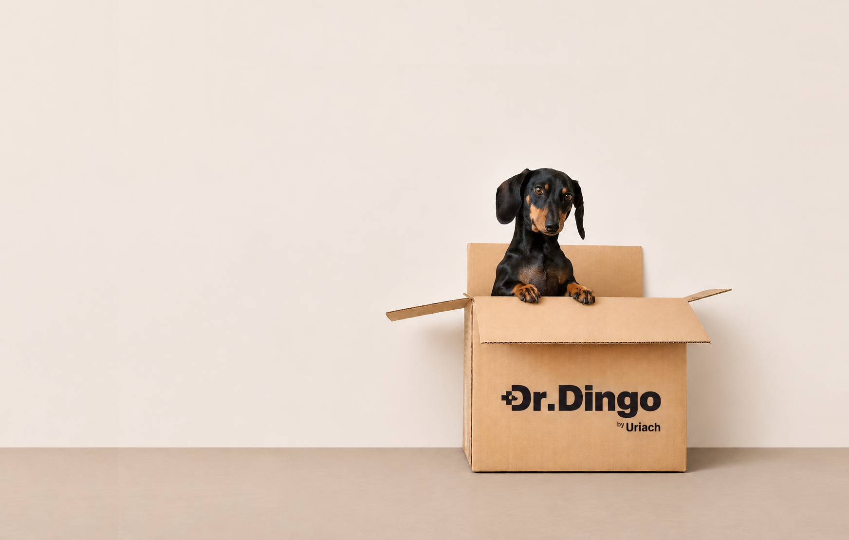
Dr Dog
Dr. Dog is a conceptual branding and packaging project that explores the intersection of veterinary science, animal well-being and the emotional bond between dogs and their owners.
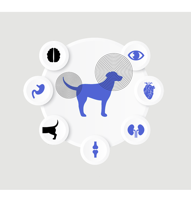
The challenge went beyond creating a range of nutritional supplements for four different canine health needs. We wanted to build a brand that could communicate medical expertise and scientific credibility without losing its connection to the animal at the heart of the project.
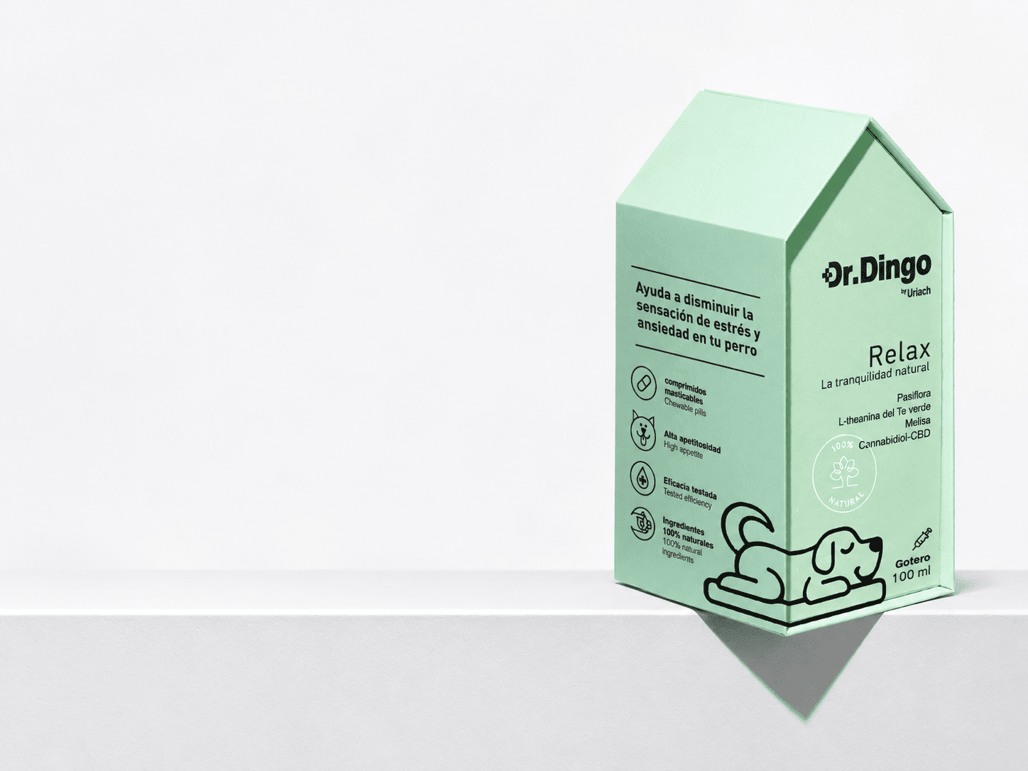
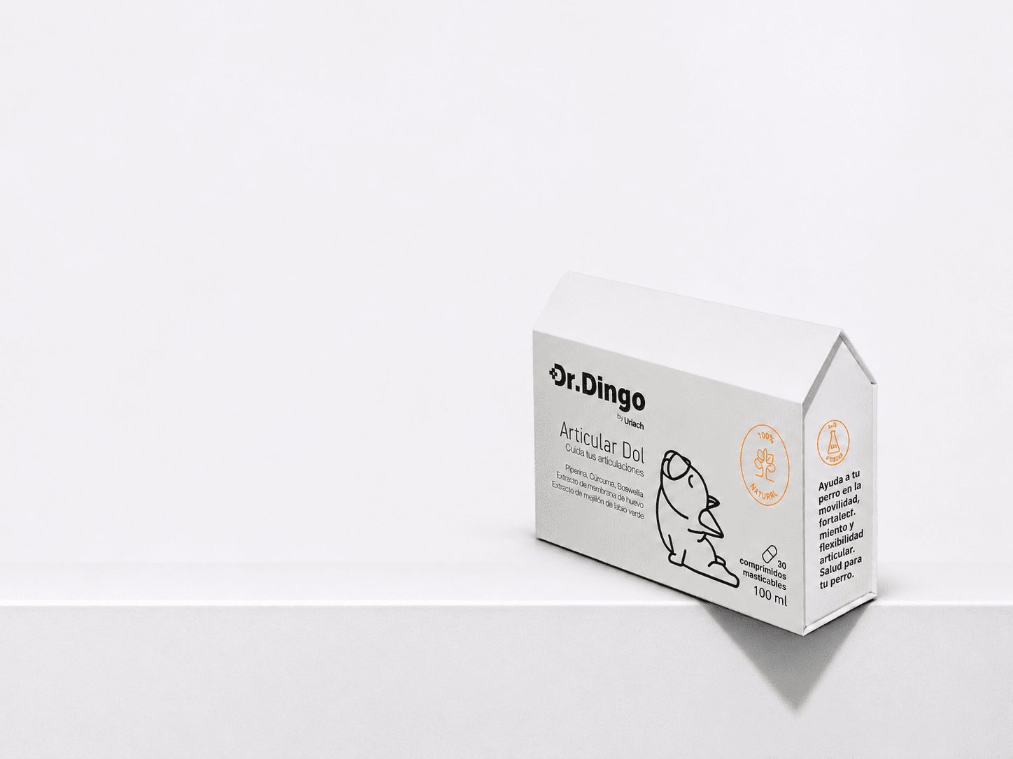
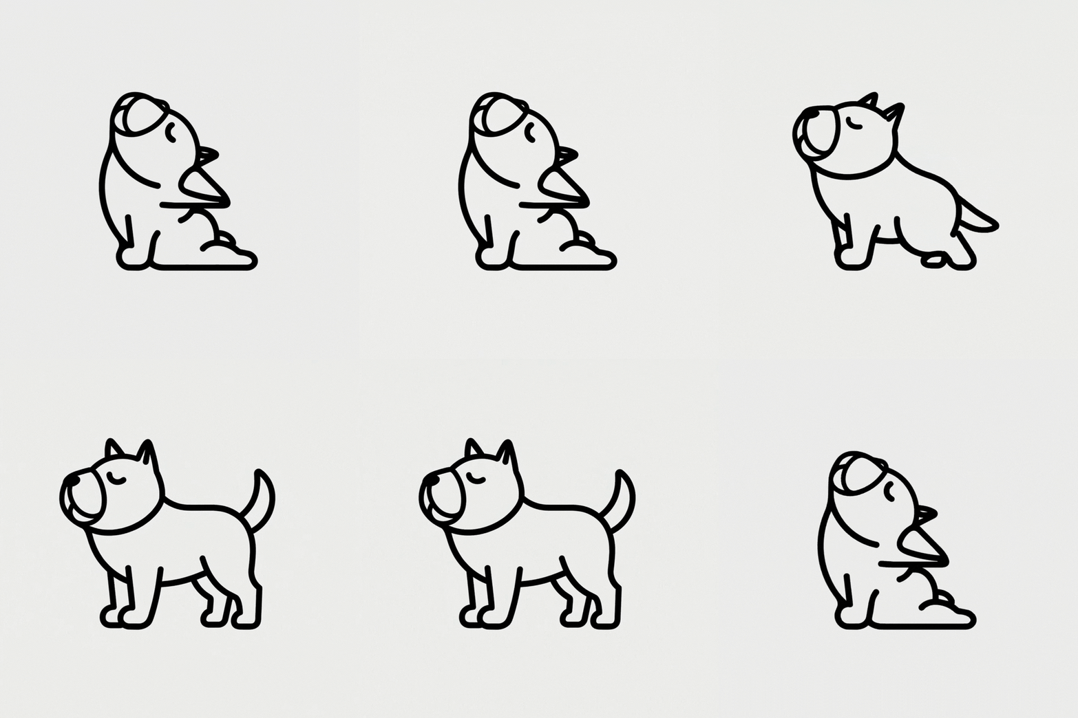
This thinking also shaped the visual identity. Rather than relying on a conventional medical cross, we explored how the logo could incorporate a more recognisable connection to dogs, creating a distinctive symbol that brought together healthcare and the world of pets.
The result was an exploration of how strategy, identity and packaging could express different perspectives on the same product, balancing science, care, emotion and environmental responsibility.
Industry
Animal Health & Pet Care
Client:
Pet Food Company & Pharmaceutical Laboratory
Creative & Art Direction:
Studio Regina Puig
Status:
Conceptual Project ·
Not Commercialised
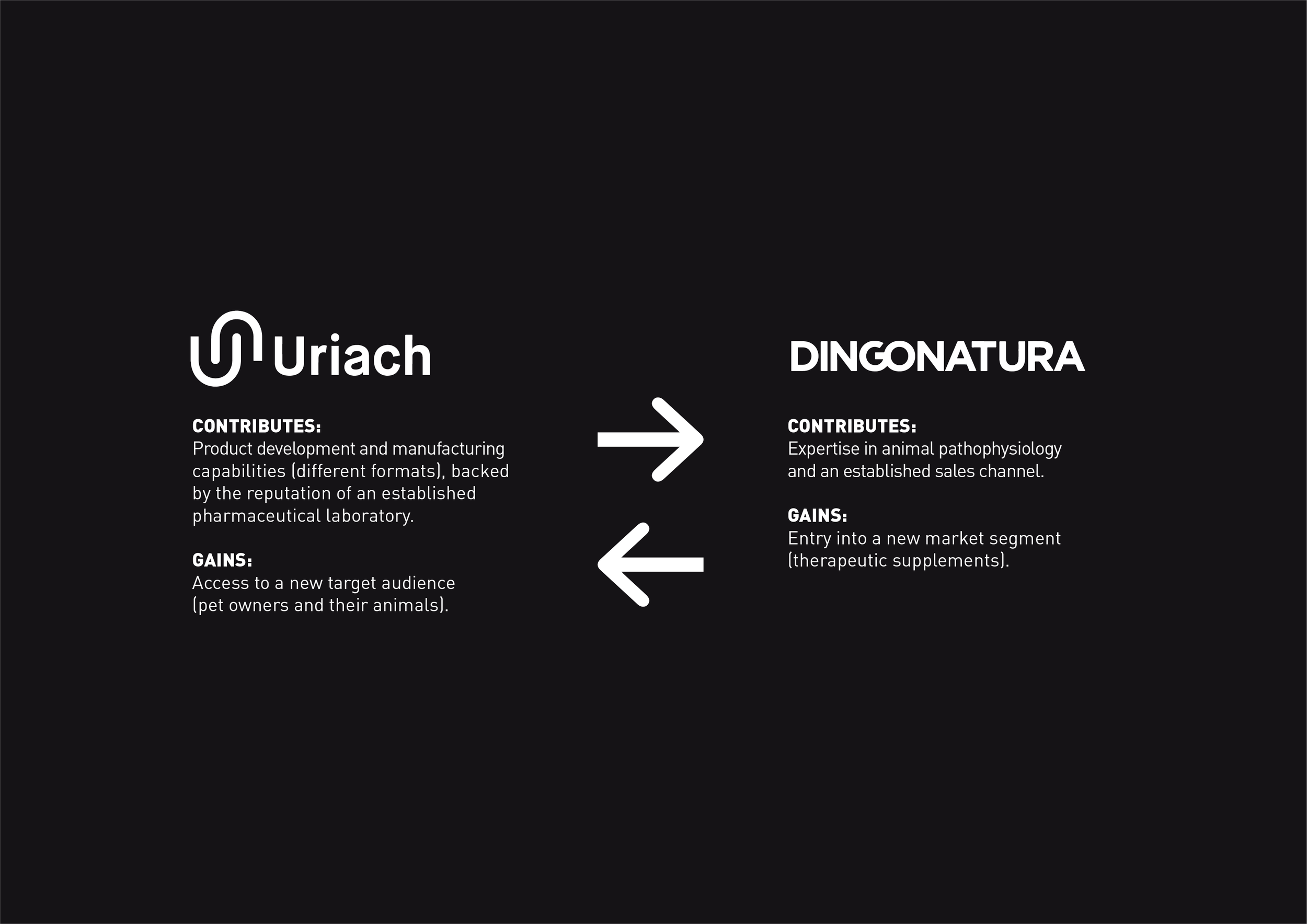
The Strategy
The complexity of the project lay in exploring four different approaches to positioning and communicating the same product through packaging design.
Our challenge was to understand how different visual languages could influence the perception of the brand, from medical expertise and pharmaceutical credibility to emotional connection and environmental responsibility.
Rather than defining a single creative direction, we developed four distinct strategic territories, each offering a different perspective on canine health and well-being.
The Solution
We translated these four strategic approaches into four distinct packaging concepts:
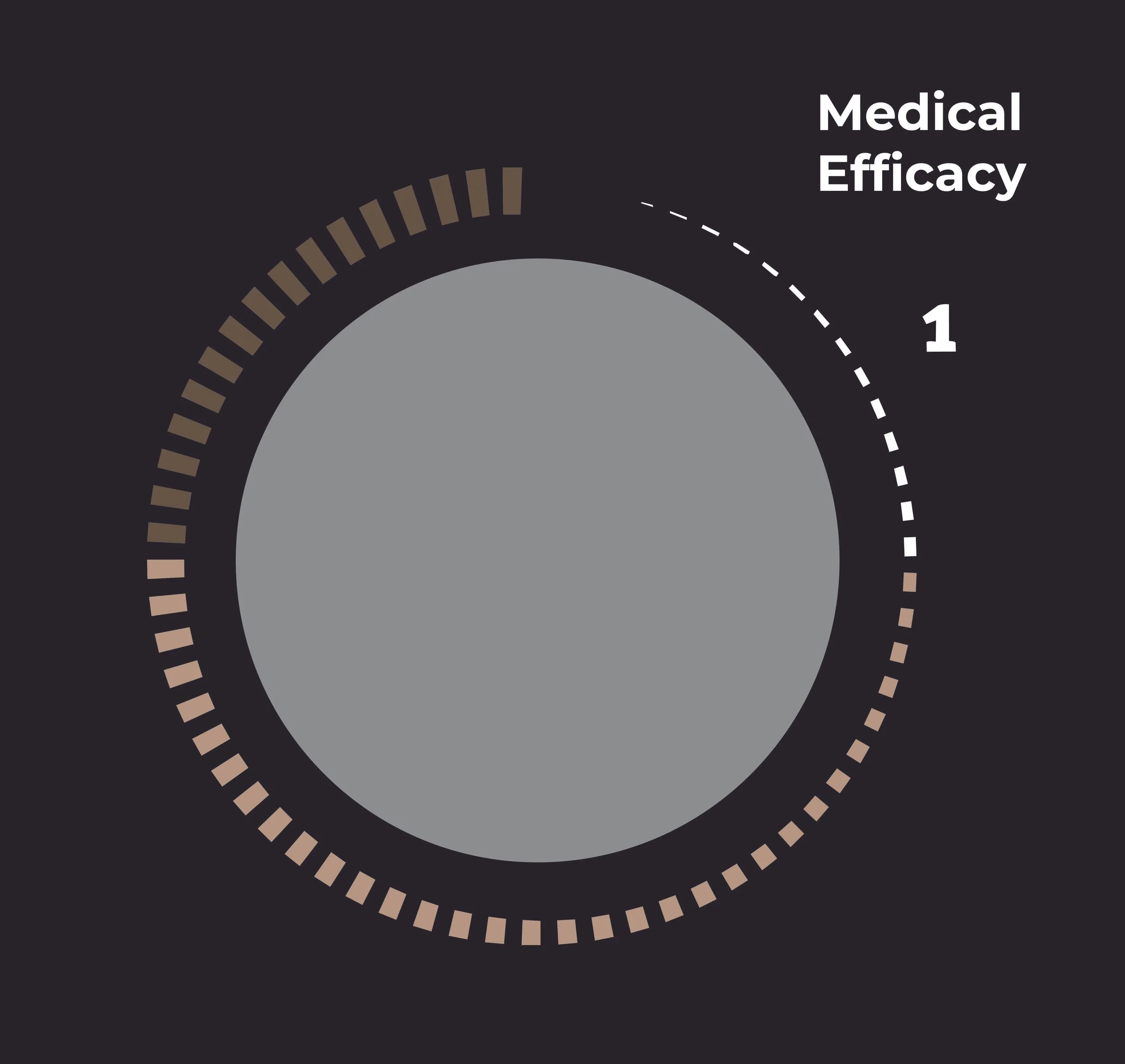
01. Medical & Technical
A clinical, precise and information-led approach, inspired by veterinary medicine. Clear hierarchies, structured layouts and a technical visual language communicate expertise, reliability and scientific rigour.
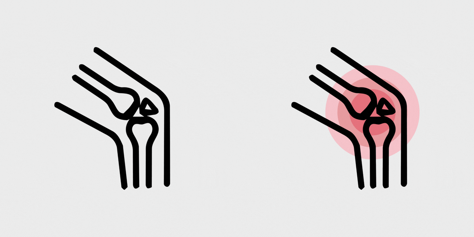
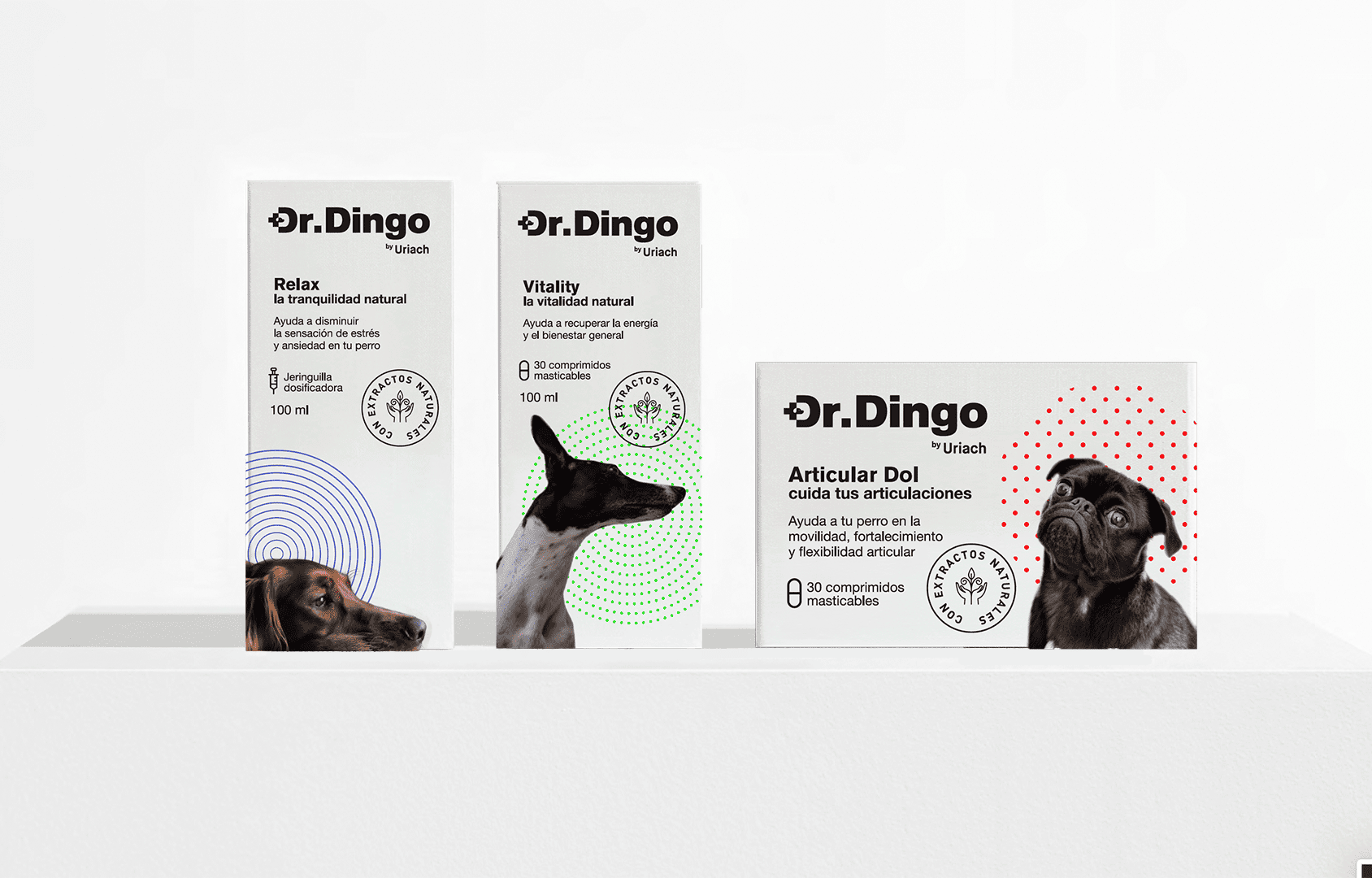
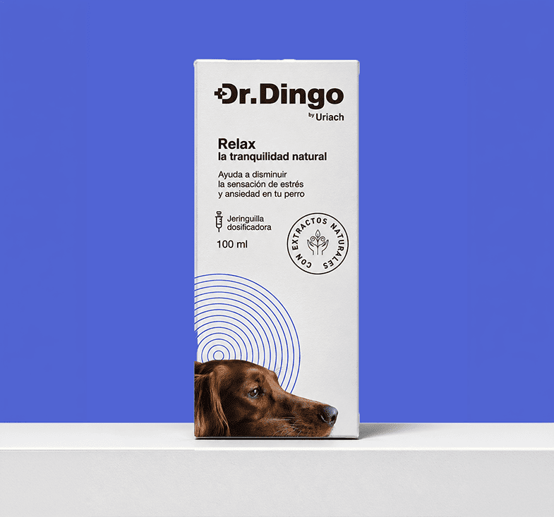
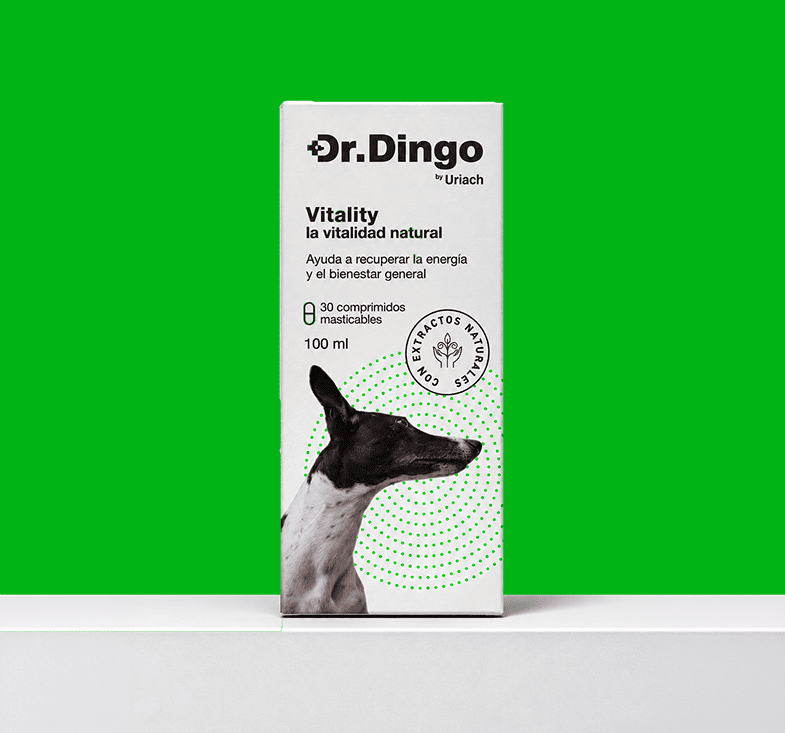
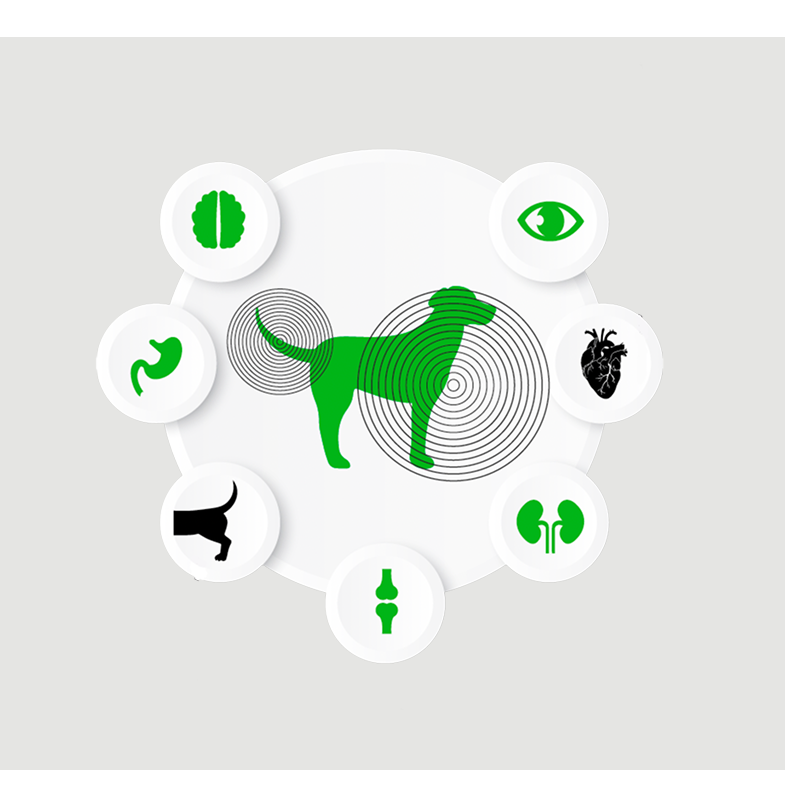
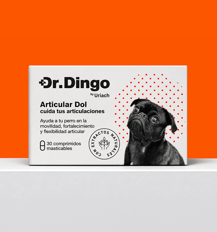
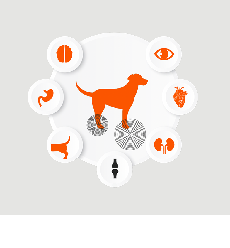
02. Pharma & Health
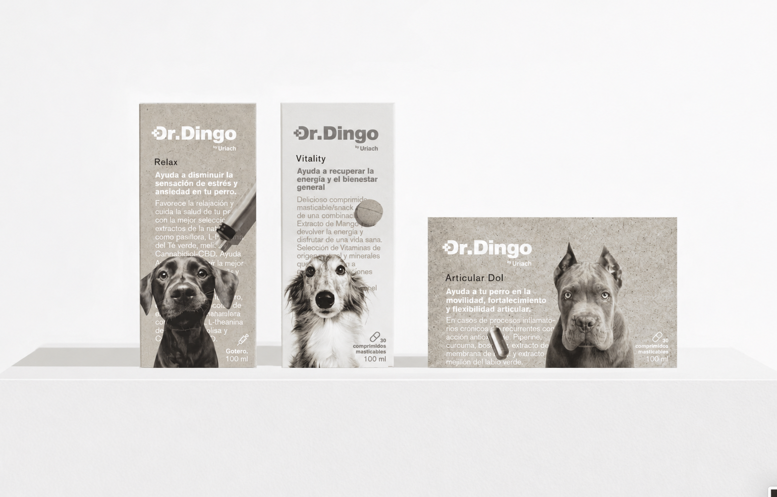
A contemporary pharmaceutical aesthetic that balances scientific credibility with well-being. A clean, reassuring and accessible identity designed to communicate health, efficacy and trust.

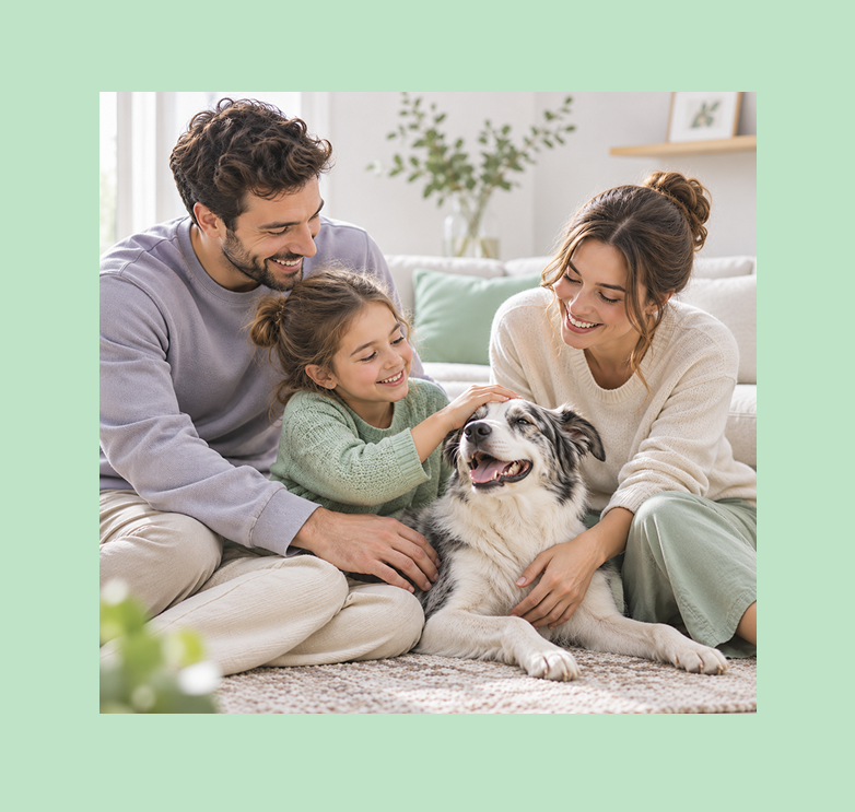
03. Family & Emotional Connection
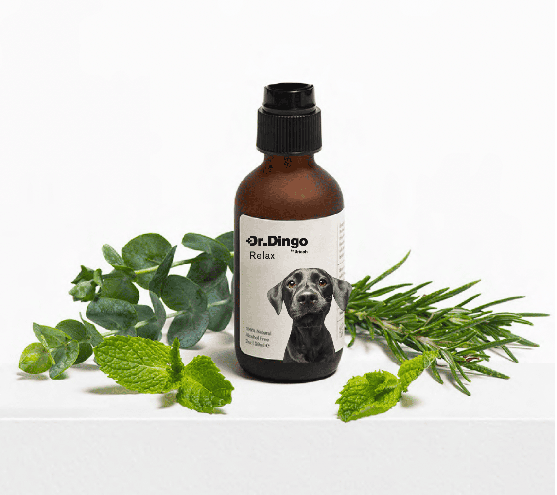
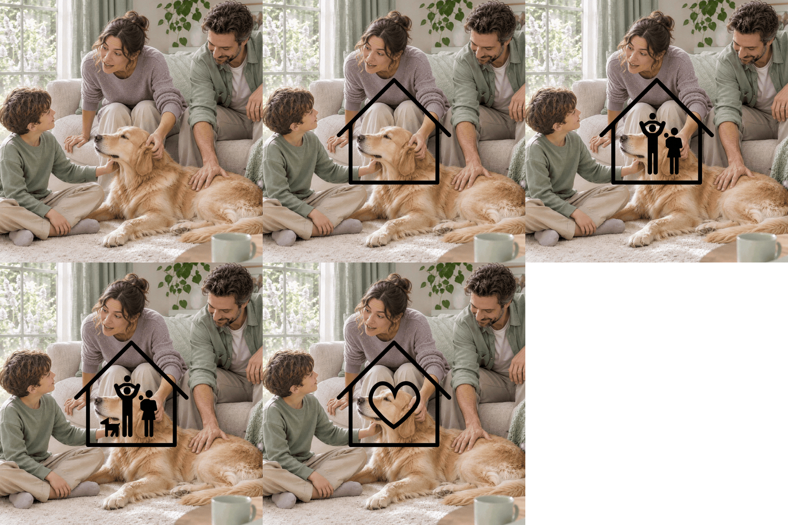
A warmer, more approachable direction built around the idea that dogs are part of the family. A friendly visual language that celebrates the emotional bond between people and their pets, making everyday care feel more personal.
04. Sustainable & Essential
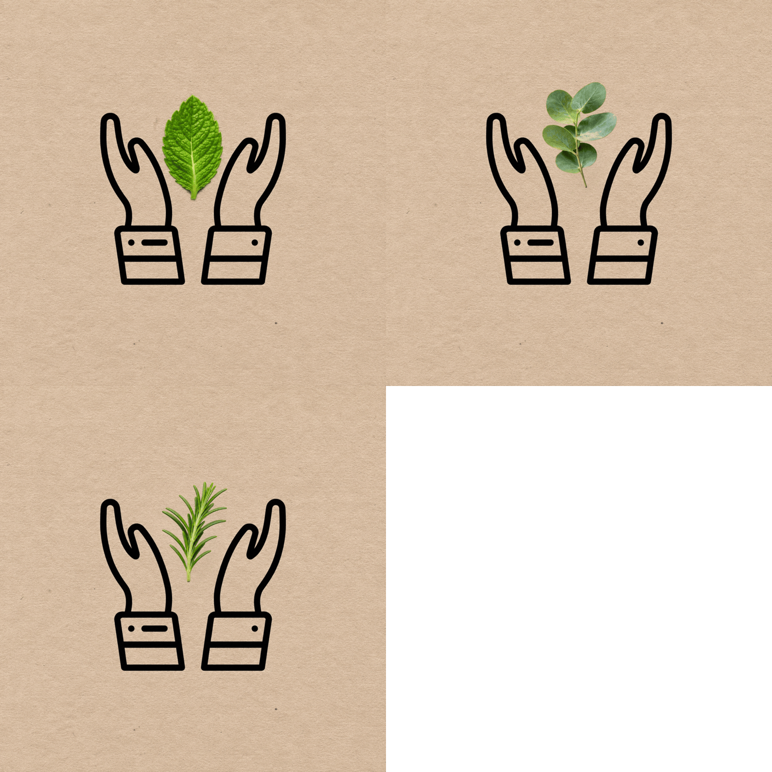
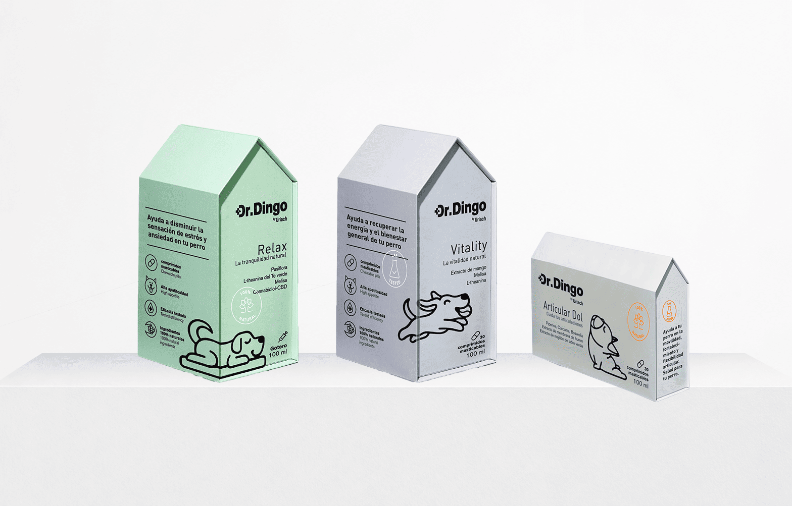
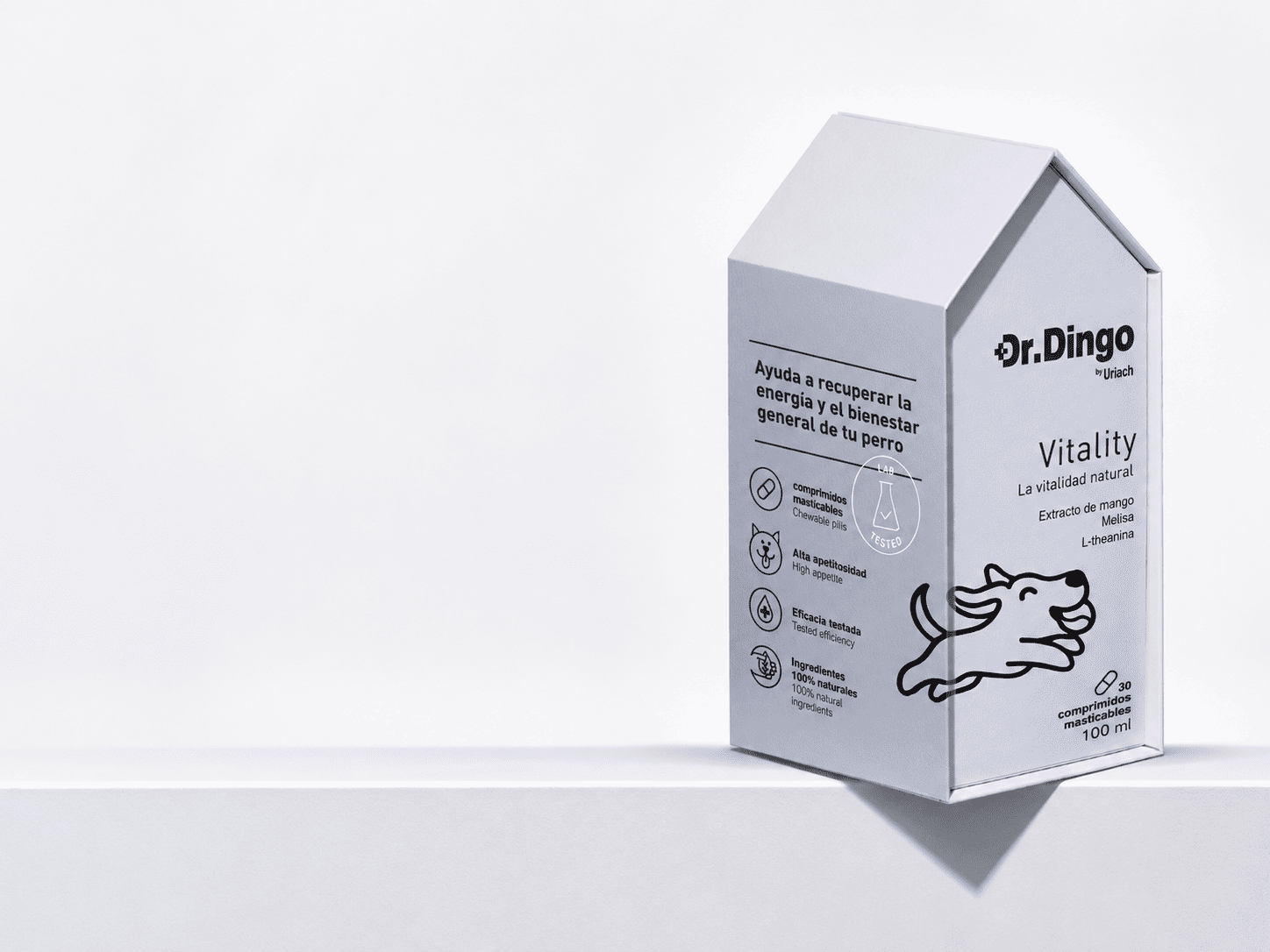
A packaging concept driven by environmental responsibility. By eliminating unnecessary plastic and secondary cardboard boxes, we explored a simpler, more resource-conscious solution where sustainability becomes an integral part of the design.

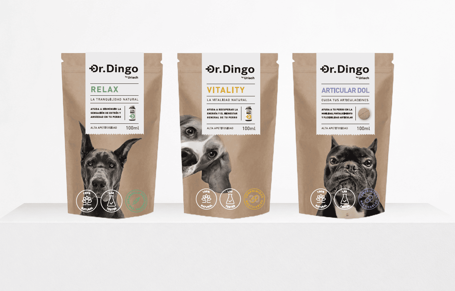
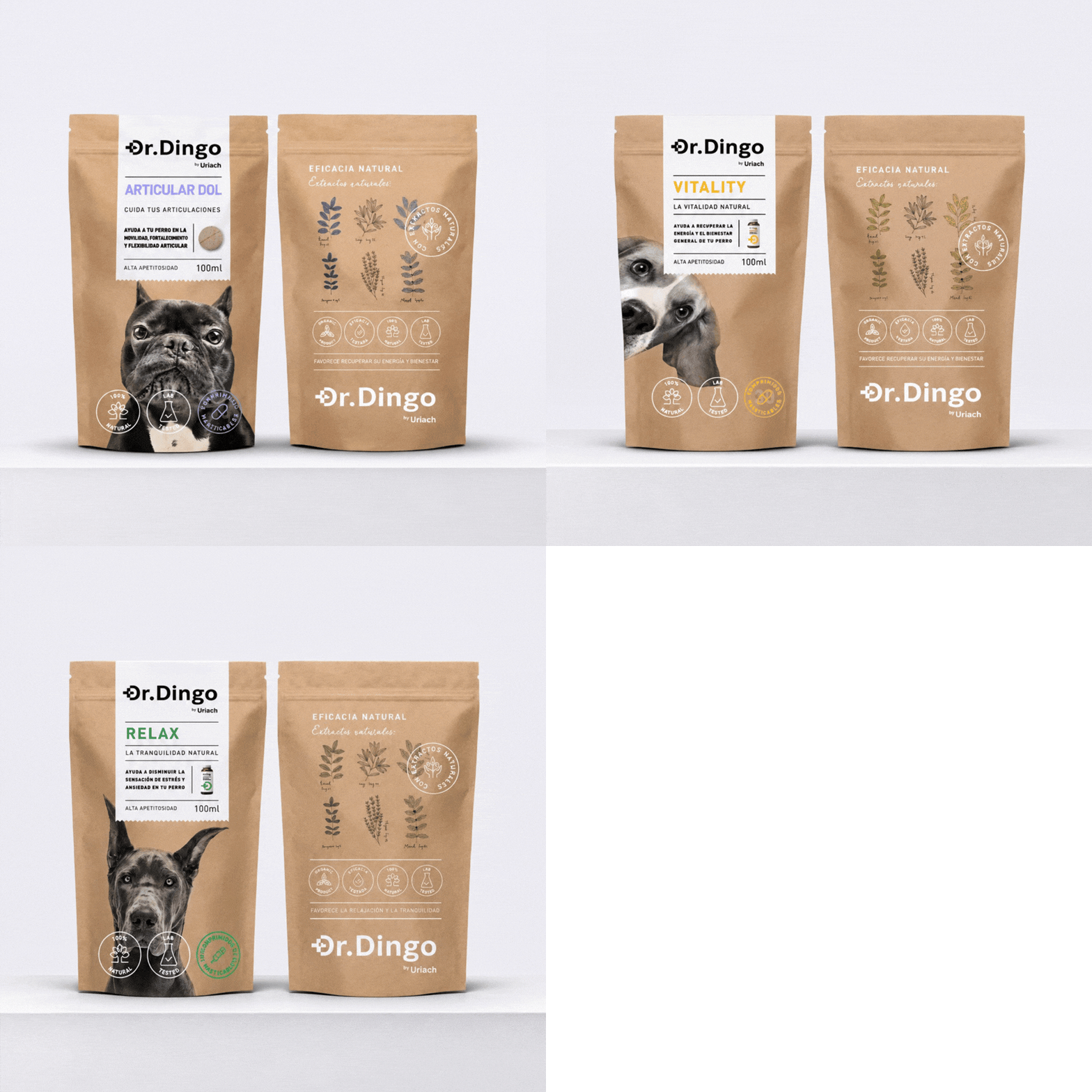
Together, these four creative routes demonstrate how a single product can be interpreted through different strategic perspectives, each shaping a distinctive brand identity and packaging experience.
Although the project was not brought to market, it reflects our methodology: combining strategic thinking, creative exploration and design to discover new possibilities for brands.
We’re passionate about bringing your ideas to life with designs that truly connect and inspire.
Other projects you may like…

Titan

Carnaval 2024

Mercabarna FastPass

Milola

MŪN Isotonic

MŪN Radikal