MŪN Radikal
New packaging line from the brand MŪN Ferments for their new line MŪN Radikal. MŪN Radikal is crafted for bold kombucha lovers who crave unconventional flavours and daring combinations.
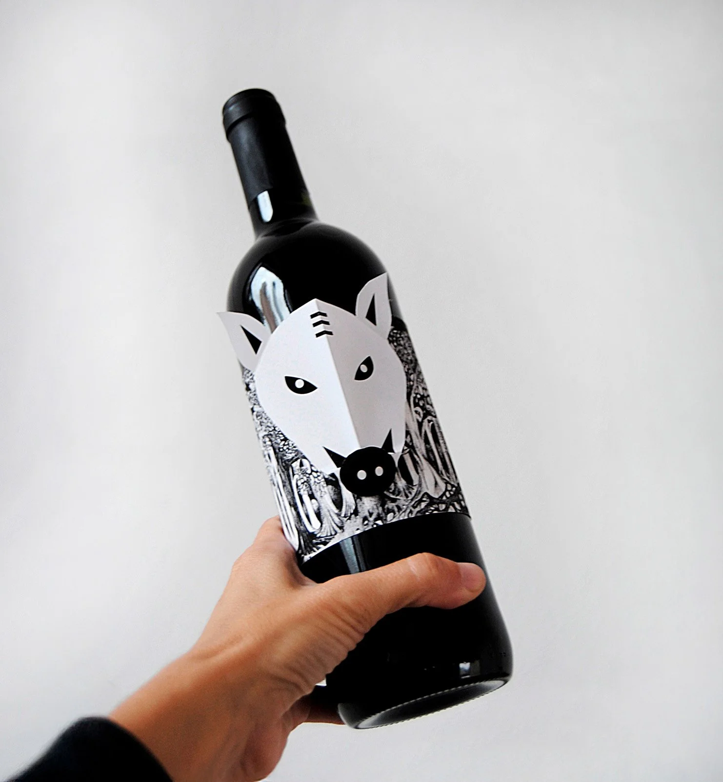
We were entrusted with designing the label for this new Mūn Radikal range. Mūn Ferments is a symbol of innovation in Spain, renowned for its distinctive flavours and unique formats in the mass market. We proudly see ourselves as the "black sheep" of the kombucha world—and we want our image to reflect that.
Creative & Art Direction:
Studio Regina Puig
Label production:
Group Micros
Industry
Packaging
Food&Beverage
Client:
MUN Ferments


The Strategy
The Mūn Radikal strategy is built on bold differentiation, positioning itself as the "black sheep" of the kombucha world—rebellious, unconventional, and unapologetically unique.
Instead of catering to the mainstream, it targets a niche audience of adventurous kombucha lovers who crave unexpected flavour combinations and identify with the brand’s daring spirit.
Mūn Radikal sells a lifestyle, appealing to those who embrace individuality and reject the ordinary. With its alternative flavours, and premium positioning, it stands out as a kombucha for those who dare to be different.
The Solution
Our concept is inspired by a flock of black sheep—a powerful symbol of rebellion, individuality, and bold character. In a world that often embraces conformity, we stand apart, celebrating those who dare to be different.
Each flavour in our collection is embodied by a unique sheep, crafted through the power of AI-generated illustrations that add a touch of futuristic creativity to our vision. These designs not only enhance the brand’s distinctiveness but also reflect our commitment to innovation and breaking boundaries.


What we did

Brand Design
Strategy
Visual Identity
Packaging
Art direction
Our clients talk

We’re passionate about bringing your ideas to life with designs that truly connect and inspire.
Other projects you may like…

MILOLA

MŪN Isotonic

MŪN premium

Flopp ECO

Priordei
Set parcel·les i un senglar