
Milola
Milola is a brand that redefines the way we eat, offering a new perspective on enjoying food without compromise. It embraces the pleasure of gastronomy while prioritising health, creating products for those who refuse to choose between indulgence and well-being.
Our design studio had been commissioned to develop a new pack, which evolved into a broader brand strategy and positioning for Milola. The strategy focused on identifying the target customer and positioning the brand accordingly. This entails redesigning the box packs and ensuring individual packs align seamlessly with the new identity. Additionally, we will establish a cohesive visual language and strengthen the brand’s digital presence.
Industry
Packaging
Food&Beverage
Client:
MILOLA
Creative & Art Direction:
Studio Regina Puig
Photographer:
Noemí Jariod


The Strategy
Milola’s rebranding is driven by its core audience, with 78% of its customers being women. This insight shapes the brand’s evolution, aiming to attract those who seek high-quality, indulgent products that complement their lifestyle while maintaining a balance between pleasure and wellness.
Positioned as a premium brand, Milola offers a refined treat without compromising on health. With ambitions to expand internationally, the brand is strategically evolving to resonate with a global audience and establish a strong presence in new markets.
The Solution
We developed a series of six wraparound labels for each bottle, with each bottle featuring a character interacting with the sea and water.
Each label illustrated the story of a character—playing, relaxing, exercising, and so on...
Different photo montages were created to illustrate each concept. This innovative solution resulted in a collection of labels that not only offered literary appeal but also perfectly communicated the essence of seawater in every bottle.

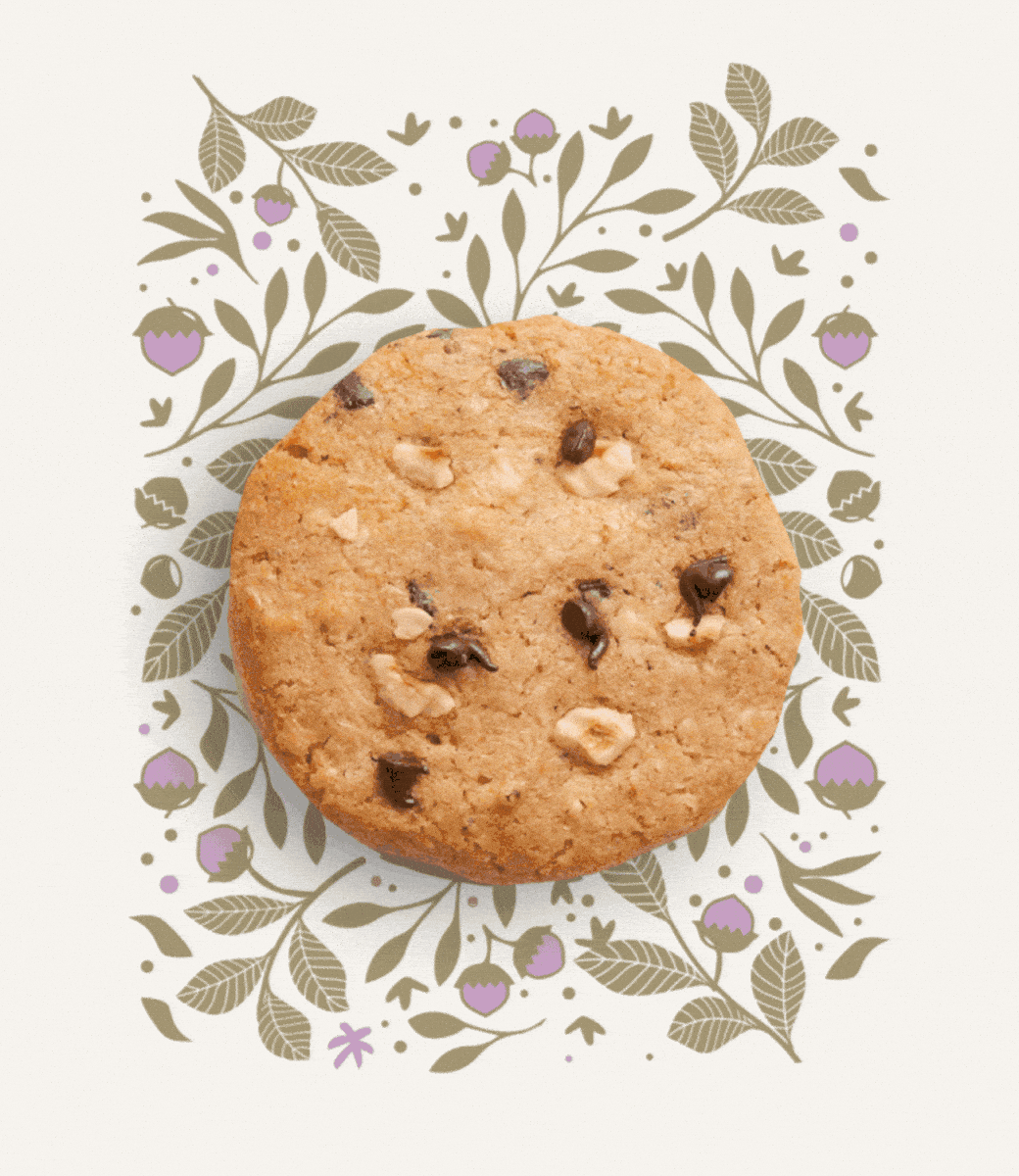
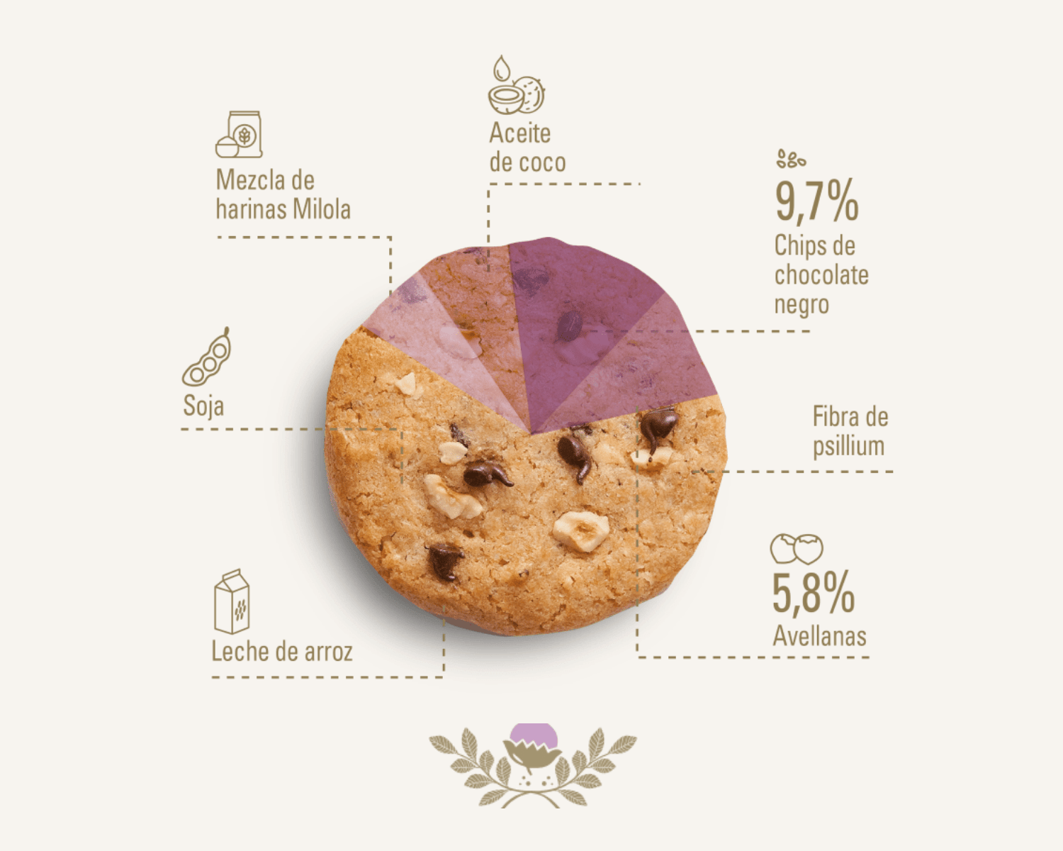
Assorted Milola artisan cookie boxes and wrapped individual cookies with various flavors, including spiced carrot, lemon & cardamom, hazelnut chocolate chip, double chocolate banana, raspberry lime, and lemon chia, displayed in colorful packaging.


What we did

Brand Design
Strategy
Visual Identity
Packaging
Art direction
Digital
Website design
Social Media Guidelines
Fisical
Brand Stands
Trade Show Displays
Posters
Flyers and Brochures
Business Cards
Our clients talk
We’re passionate about bringing your ideas to life with designs that truly connect and inspire.
Other projects you may like…

Titan

MŪN premium

Carnaval

Hypnotic Barcelona

MŪN Isotonic

MŪN Radikal